
Role - Visual/UI Design Consultant
BuildZoom wanted a redesign of their landing page, contractor profile page, and modal system. We had an eight-person team made up of four designers and four growth marketers.
My responsibilities
Update the look and layout of the contractor profile screens and the modals associated with those screens.
Metrics for success
Conversion rate, time-on-site, and user comprehension scores.


User research
The first step in our design process was to learn everything we could about BuildZoom's key market segments. Our growth team probed BZ's Analytics, and based on their findings and interviews with users who fit the bill, we were able to put together a persona that helped guide our design decisions moving forward.
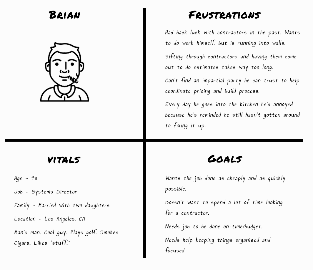
Data-driven Persona
To gain a better understanding of the problems users were having with the site, we ran a five-person, five-question unguided usability test. The results were very telling:

0 out of 5 users understood the main value proposition.

0 out of 5 users understood the BuildZoom score.

0 out of 5 users understood the map on the contractor profile page.

1 out of 5 users knew how long it would take to receive competitive bids from BuildZoom.

0 out of 5 Understood the images on the homepage
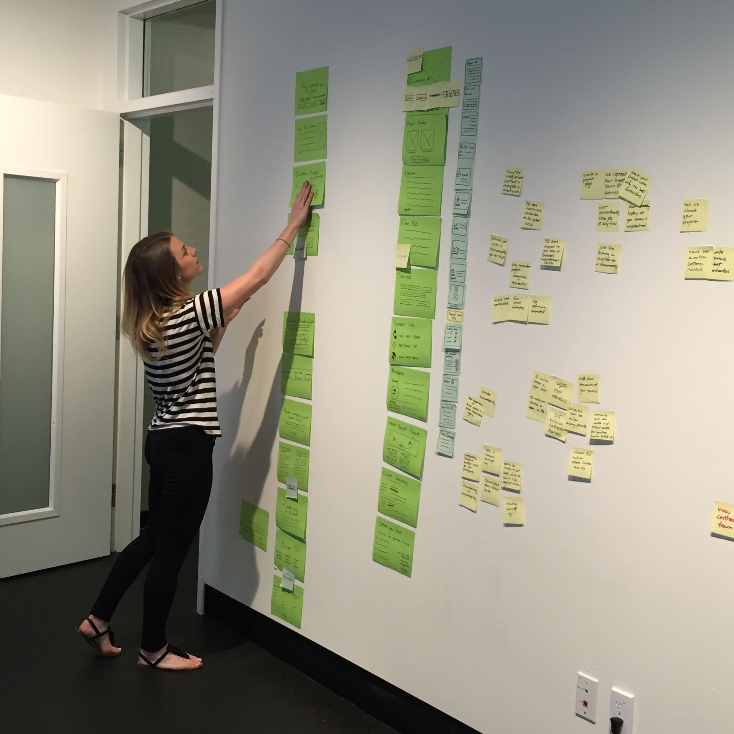
Design process
From the user test we quickly learned that the overarching problem we were looking at was comprehension, so we scaled back on some of our other goals and made comprehension our primary focus.
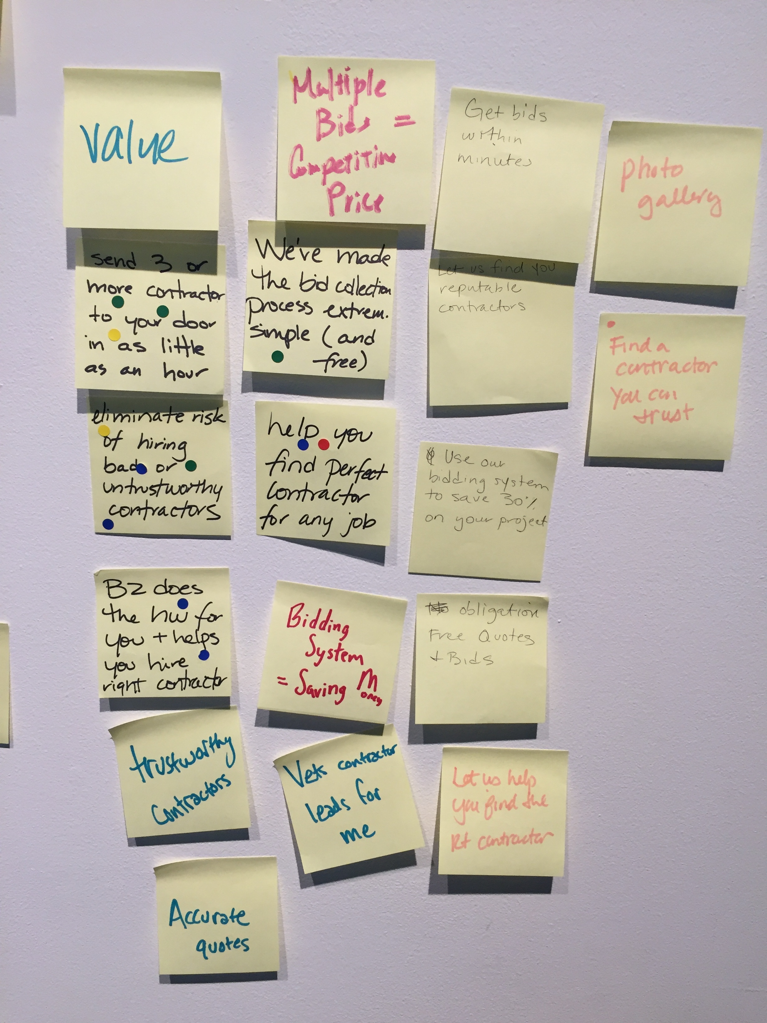
A big part of the problem was successfully communicating BuildZoom's different value propositions. To help accomplish this, our team worked out a system for isolating value props and categorizing them into different themes. We then ranked themes in order of importance (per user research). And this gave us a good idea about how we should proceed with layout, visuals, and messaging.
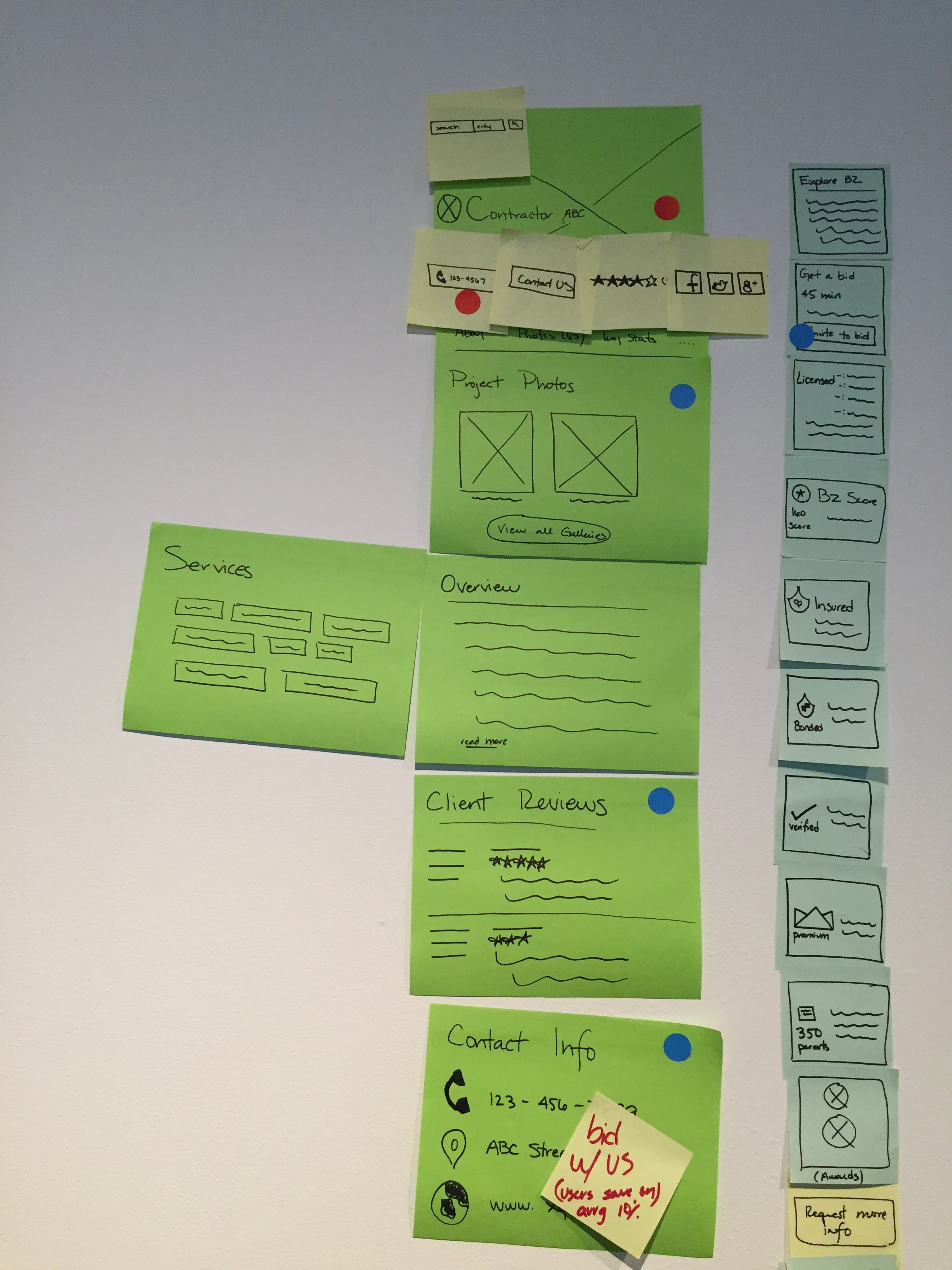
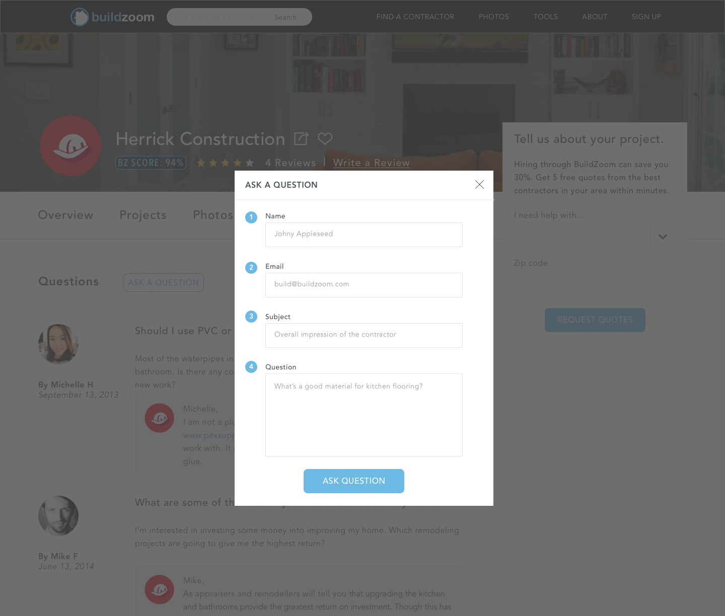
Contractor profile - first iteration
After several interviews with target users, we gathered that the one problem everyone was running into with the contractor profile page was that there was just too much information on the screen. No one knew where to start or what the main call to action was. They just wanted see a few things:
An 'About' blurb written by the contractor.
Services offered.
Verification of contractor license, insurance, and bond.
Work samples.
Prices ranges.

The original contractor profile was populated by stock text in the overview section. It also went into great detail on things like permits--how many and where, etc., as well as the logic behind the BuildZoom Score.
We found that users weren't too interested in these things and they were taking up valuable real estate; though for SEO, the client wanted to keep them, so on this first past I just moved them down and simplified them where possible. I prioritized things users were looking for first and put those near the top. I simplified the credentials section and moved it into the overview. I changed the color of the 'Request a Quote' button, highlighting it as the main CTA. I added a bookmark feature, so users could keep track of contractors they were interested in. You can't see it in the sample above, but I also added an average pricing feature just below the projects gallery.
Main value prop
For the main value prop, I designed a simple visual illustrating how BuildZoom works to go on the landing page just below the fold. For help with the copy, I went undercover, posing as a user in an online chat with the CSR from BuildZoom. I asked her if she could tell me how BuildZoom worked in three steps, and her response proved very helpful.

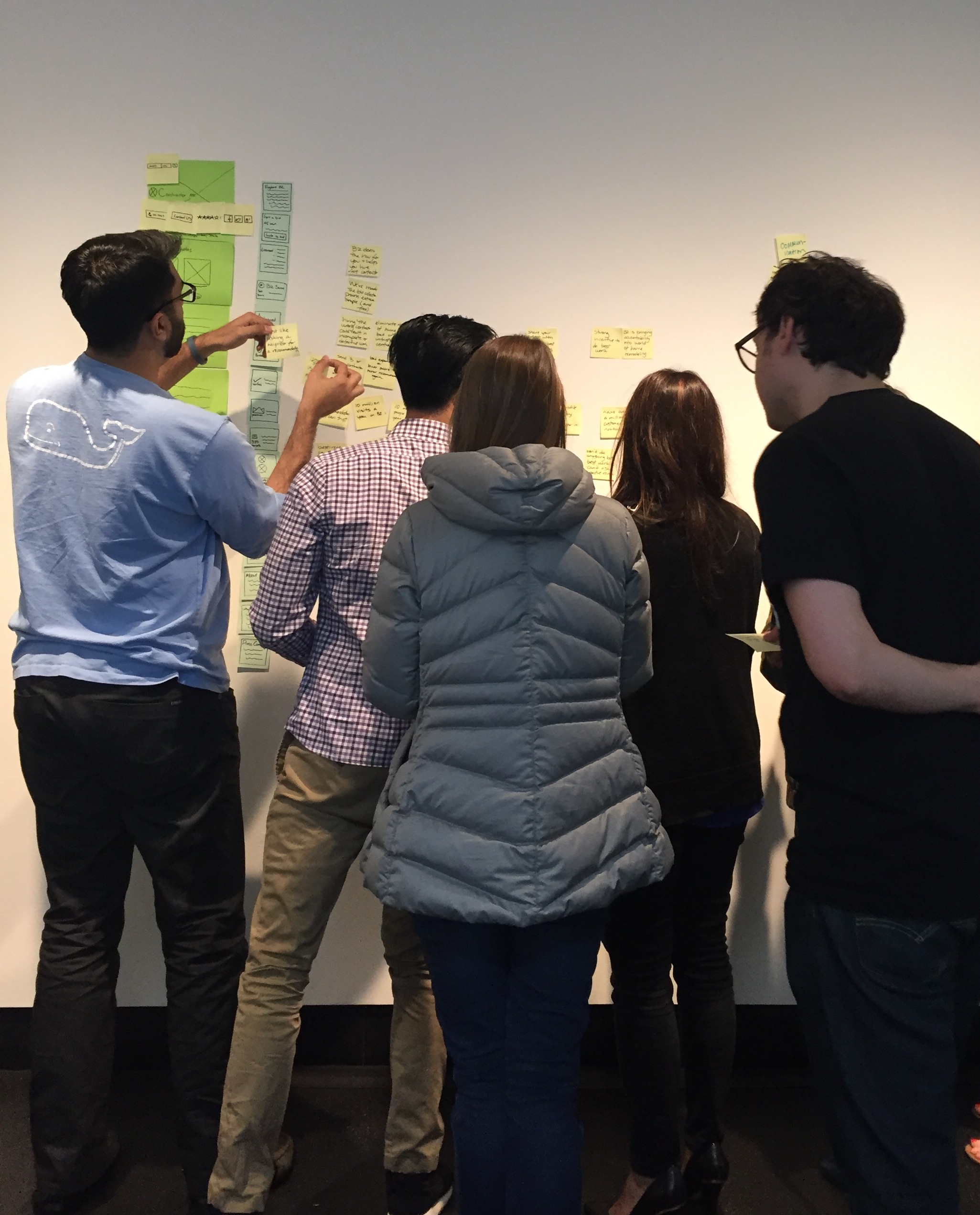
Prototype
All four designers contributed to the prototype. I designed the value prop visual, the new 'Ask a Question' modal, the 'How BuildZoom Score Works' modal, as well as various aspects of the contractor profile UI. The goals for the prototype included increased scores in comprehension, trust, and relevancy, as well as a clearly lighter and more consistent aesthetic:
Prototype Validation Test

5 out of 5 users understood the main value proposition.

5 out of 5 users understood the BuildZoom score.

5 out of 5 users understood the map and found it to be useful and interesting.

3 out of 5 users understood that they would receive competitive bids from BZ within minutes.

5 out of 5 users understood that the images on the landing page were of existing projects on the site and linked to customer testimonials.
User study credits
Methods and results above are taken from BuildZoom UX Research Studies (I mainly did UI/Visual Design). To learn more about the talented team-members who ran the BuildZoom Study, check out the portfolios of UX Designer, Jae Young Paek and Project Lead, Meredith Fay.